A star plot allows one to observe data and how they relate for many different variables. In the figure above, the letters are the variables and the closer the line is to the variable, the stronger the measure of that variable.
A similarity matrix shows similarities between two things through color. In the case of this similarity matrix, the closer to red it is, the more similar they two things are, or the better their correlation (because its approaching 1, a perfect correlation).
A stem and leaf plot is a way of plotting data according to place value. This sort of plot allows you to see the shape and distribution of the data. In the plot above, you would read the first six numbers as: 1,8,9,32,34,37. So the stem is the base, and the leaf is the ones.
A boxplot is a way to represent data where you plot the maximum, minimum, upper quartile, lower quartile, and median. This allows you to see the shape of the distribution.
A histogram is like a bar graph except the horizontal data is shown as data ranges. For example, rather than one of the horizontal values being 1, it would be 0 to 1, or 1 to 2. Above is an example of a histogram.
A parallel coordinate graph shows the relationship of a series of values, each with different variables. Above is an example of a parallel coordinate graph.
A triangular plot shows the relationship between three different variables for a certain area. The one above shows the percentage of sand silt and clay for a certain region.
A climograph shows the relationship between average monthly precipitation and average monthly temperature by plotting them on the same graph. The above climograph is for Guam. As you can see, the temperature remained fairly constant, while the rainfall fluctuated.
A population profile, or population pyramid, shows the age distribution of males and females in a region. This is a positive distribution, meaning there are more younger aged than elderly. A negative distribution would be larger at the top and smaller at the bottom.
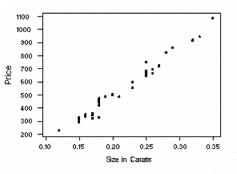
A scatter plot is a way to plot bivariate date on a graph with and x and y axis. Each point has a value under each variable which give each value a coordinate pair, or x and y value. The above scatter plot shows the relation between diamond price and diamond carat.
An index value plot is a visualization plot in which an index value, rather than absolute value, is plotted on a line graph. Above is an example of this for return on closing.
A bilateral graph is a graph that allows you to see more than one set of data at a time. In this bilateral graph, one can see what percentage of a country agrees, disagrees, or refuses a question and can also see this for all the continents.
A DOQQ, or Digital Orthographic Quarter-Quad, is an aerial photograph that has been orthorectified, or removed of distortion, so the picture may be used as a flat map with accurate land distances. Above is a 1998 color infrared DOQQ of Johnston county.
A DEM, or digital elevation model, is a digital elevation map that is in raster, or pixel, format and shows relief through color. The above picture is a digital elevation model of part of Pakistan.
A DLG, or digital line graph, is digital vector data. That is, all the information about the graph is stored as lines and areas. DLG's provide much information about an area such as the topography, roads, streets, etc. Above is an example of a DLG of Beaufort, South Carolina.
LiDAR, or Light Detection And Ranging, is like radar, in that it can detect the distance to certain objects, but it uses laser instead of radiation. This is a LiDAR show of the NASA shuttle, Discovery.
The Doppler Radar is used very much nowadays to watch and predict the activities of rain and even hurricane systems. You see it on probably every weather channel, every day. This is a Doppler photo from hurricane Dennis on July 10th, 2005.
This is a black and white photo of White Mesa, San Ysidro, New Mexico. Black and white aerial photography is the earliest and cheapest aerial photography.
Infrared aerial photography allows mappers to see an aerial shot of a certain land without interference from smoke or haze. It is also used in many other scientific processes. This is an infrared shot of the Lyndon B Johnson National Historical Park.
A statistical map is exactly how it sounds. It is a map that is used to show some sort of statistical data. In the case of the map above, the statistical data shown is the growth rates of the internet in each country of Africa.
A cartogram is a map that substitutes land area for some variable. In this map, they substituted land area for whether the area voted Democrat or Republican. They warped it all inward to show how the red is more dominant in the center and the blue stretches outward because it is more dominant on the coasts.
A propaganda map is a map that has a message behind it, meant to go out to the public. This map was a wartime map made in Germany to scare the Czechs and to show that their defeat was imminent.
A PLSS Map (or Public Land Survey System Map) shows the many features of the Public Land Survey System, such as the prime meridians and base lines. The map above shows both of these features.
A cadastral map is a map that shows the ownership of pieces of land. This map is an example of this, as you can see the family name which owns each parcel.
A nominal area choropleth is used to show nominal, or categorical, date. In this choropleth map, the sections of France are divided into categories of which president they were voting for.
An unstandardized choropleth map is a choropleth map which has not been areally averaged to some unit. In this map, each state has the number of votes but not the number of votes per some unit. This makes it unstandardized.
A standardized choropleth map is a choropleth map which has been areally averaged, or averaged to some unit (e.g. "per square mile", or "per acre"). This choropleth has been areally averaged to population per square mile by state, so it is therefore standardized.
A univariate choropleth map is simply a choropleth map that shows one variable. The choropleth above only shows the estimated median household income so it is a univariate choropleth map.
A bivariate choropleth map is a choropleth map that represents more than one variable. In this map, the color key has two axis that represent two different variables. Then the colors line up with each variable to tell how much of each.
An unclassed choropleth map is like a classed choropleth map but with out the shades of color representing different intervals. In an unclassed choropleth map, the one shade will represent the highest number, while another will represent the lowest, and then the map is colored according to the shading in between. In this map, the dark orange is the highest fertility rate, while the lightest orange is the lowest fertility rate. Then the shades in between represent numbers in between and can be estimated according to how close they are to either endpoint.
A choropleth map is a category of aerial maps show many different data. A classed choropleth map groups data into smaller groups and over intervals. This classed choropleth map breaks down the state into counties and shows the per pupil expenditure over multiple intervals.
A flow map is a map that shows the path of an item or entity across the surface or process it goes through. This is a very basic example of a flow map showing the process of making a sandwich but has the overall idea still.
A range graded proportional circle map uses circles of different sizes to represent ranges of information. In this map, the ranges are number of motor vehicle deaths and different circle sizes relate to the different ranges.
A Continuously Variable Proportional Circle Map, as shown above, uses pie charts and proportional circles to show multiple variables and how they interact in an area. This map also shows another variable through the color of the area.
A proportional circle map is a point pattern map where the point is marked with a circle rather than a dot, and the size of the circle related to the amount of the variable. In the map above, population of an area is shown through the size of the circle, as shown in the key.
A dot distribution map is a type of point pattern map which shows the frequency of a variable in an area through the amount of dots there are in that area. In the map above, the population distribution of the United States is shown through the frequency and location of the dots. Notice how more populated areas like New York are extremely crowded with dots while areas that are less crowded like the Midwest are less crowded.
A geo-potential heights map shows the elevation of the air pressure above sea level. This geo-potential map shows the Geo-potential Height field of the United States.
An isobar map is a contour map that uses contour lines, relief, and numbers to show the air pressure of an area. In the map above, the air pressure numbers are given along the contour lines and a low pressure system is marked by the large "L".
Isoline maps use the variables of the third dimension to show wind speed. In the map above, shading, color, and contour lines, and numbers are used to show the wind speeds in the Jet Stream.
An isopach map uses the variables of the third dimension to show rock or sediment thickness. This map uses color, shading, and contour lines to show the sediment thickness offshore of Mid-Norway.
An isohyet map uses contour lines along with numbers to show the amount of rainfall in an area along with its elevation. This map shows the average rainfall in October on the Hawaiian island of Kauai.
A topographic map is a hypsometric map that specifically shows the relief through contour lines. This map of Old Lyme, Connecticut uses relief to show the elevation of the area.


